What's different in Honor's EMUI 5.0?

Huawei launched the new EMUI 5.0 in India today with the Honor 8 Lite smartphone. The new user interface comes is built on top of Android Nougat and brings along all of the benefits from the new Google OS. With the Honor 8 Lite, the updated OS will be eventually rolled out in India on other Honor smartphones as well.
However, the EMUI has a tougher competition in a market full of custom user interfaces built on top of Android. There’s Samsung’s new TouchWiz UI with the Grace UX, Xiaomi’s MIUI 8, HTC’s Sense UI and other similar user interfaces from popular interfaces. The question is – what does it bring to the table to differentiate the Honor smartphones from the others?
New interface
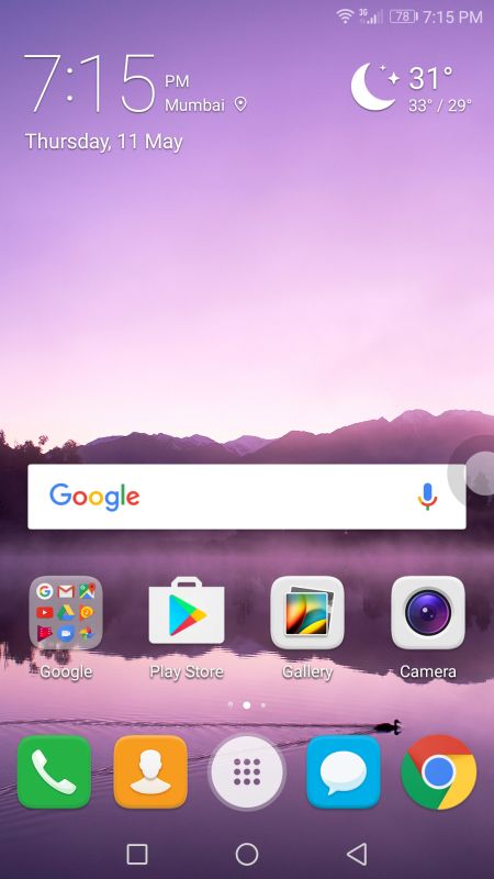
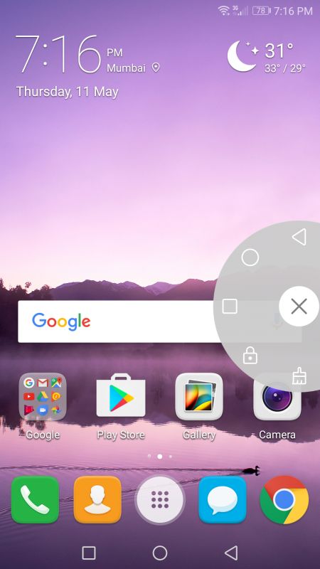
The EMUI 5.0 brings a dash of a new and fresh interface to the Honor smartphones. At first glance, it looks strikingly similar to the previous generation EMUI 4.1. But, look closely and you will notice the fine tuning that Huawei engineers have done. The home screen looks sleeker and cleaner. The icons are colourful too. There's a floating trackball with the important shortcuts which can be handy for people who cannot reach the top and bottom of the phone with a single hand usage.
New notification shade
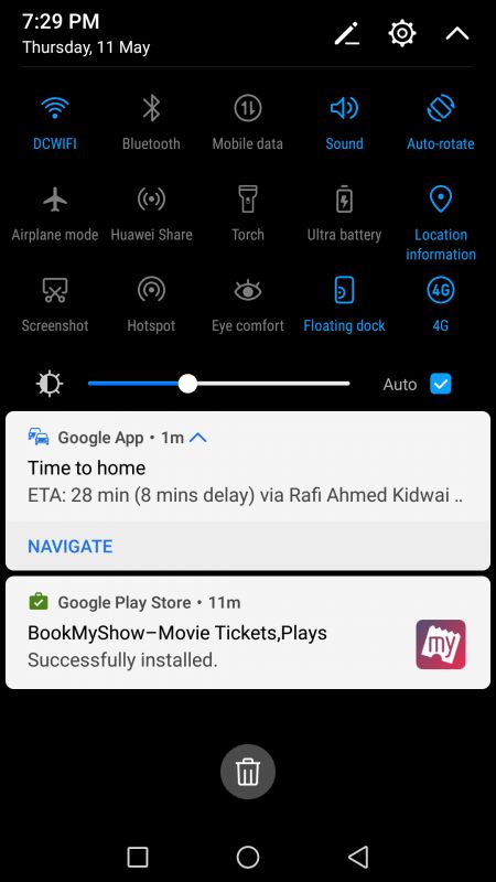
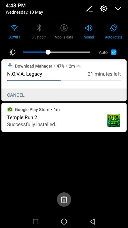
There’s a new notification shade that ditches the grey light blue colour combo for a high contrast black-blue colour theme. There are more toggles on the notification shade than before. The notifications are now displayed under the toggles, thus ditching the concept of separate windows for both in the previous versions of the EMUI. Overall, it tries to resemble the latest TouchWiz UI and stock Android’s interface. Notifications appear in the form of cards, just like the ones from the standard Android interface.
New app drawer
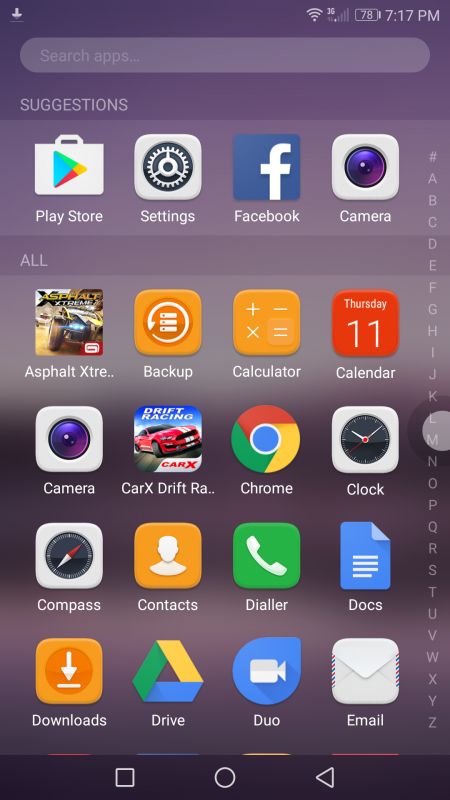
The EMUI 5.0 brings you the ability to stack your collection of apps in two ways – an iPhone-esque layout of scattered apps on the home screen or getting the good old app drawer button to have a neat home screen. The app drawer has an alphabetical scroll bar to the right to easily locate your desired app quickly.
Cards based multitasking window
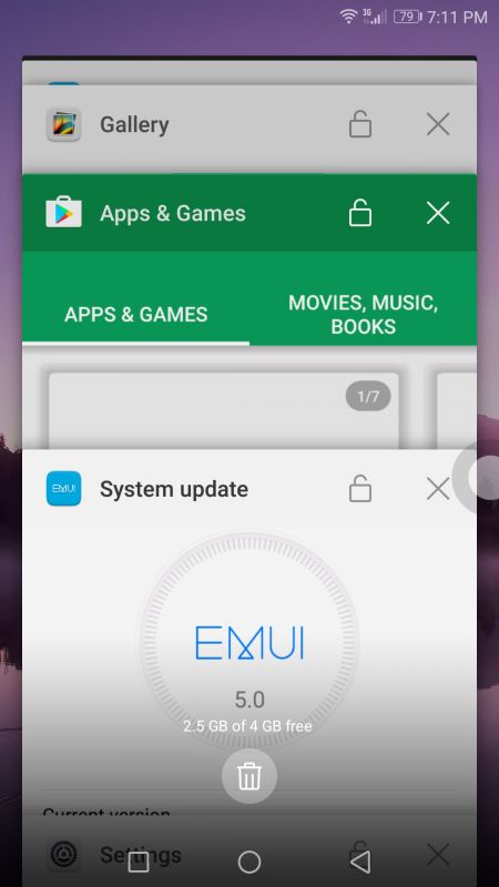
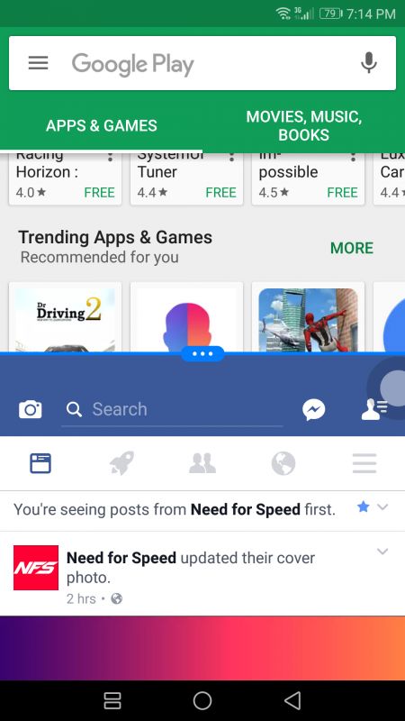
The newest version of EMUI is built on top of the Android 7.0 Nougat. That means you will be able to run two apps side-by-side. EMUI 5.0 ditches its old iPhone inspired window interface in favour of stock Android-like cards system. You can tap and hold on the top bar of a particular app window to enable the split-screen mode.
Overhauled Camera UI
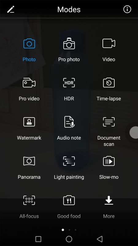
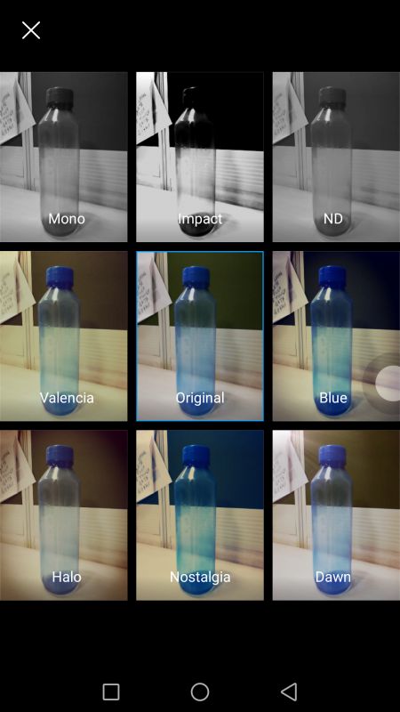
The camera also receives a makeover in EMUI 5.0, with some slightly newer icons as well as the ability to remove certain “modes” which are now known as plug-ins. This lets the user delete plug-ins that go unused, making more space for useful ones. It also lets the user add upcoming plug-ins for the camera. You will also find live filters to be used while clicking pictures.
HiBoard
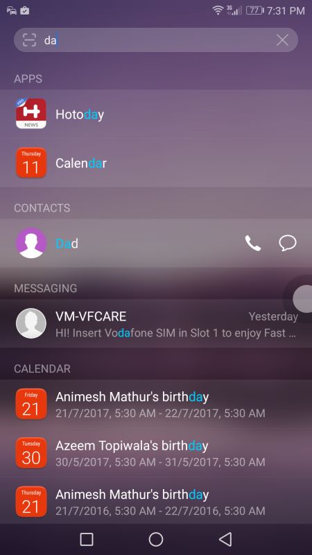
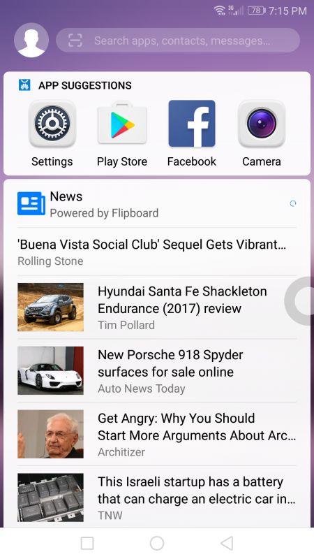
If you swipe to the extreme left of the home screen, you will be greeted by the HiBoard. The utility is basically a provision for a search option specifically for the device’s storage. You will be able to look for apps, contacts, calendar events and so on.
Below that, you will be greeted with news from Flipboard, arranged in the form of cards. It seems that this space will evolve into a Bixby-esque personal assistant interface in the future.
So, in a nutshell, the EMUI 5.0 is a decent looking interface with a major focus to be clean and slick. You will still find it confused between choosing the best of iOS and stock Android interfaces. But, it has improved vastly from its past versions and it seems that Huawei finally has an interface that will keep us looking for the next version in the following year.
We experienced the EMUI 5.0 on our test unit of the Honor 8 Lite. If you want to know more about how the Honor 8 Lite works as a daily driver, then keep an eye for the review of the smartphone soon.

