Official Apple iOS 13 screenshots leaked online and they look gbeautiful

At WWDC 2019, due to be held on June 3, Apple will officially announce its next big mobile OS — iOS 13. Earlier, we heard rumours about what features the new OS will entail and now, ahead of the official announcements, we get screenshots of iOS 13, and it looks great.
Out of all the features due to feature in iOS 13, the biggest one is Dark Mode. While concept renders gave us a preview of what to expect, the new leaks show what it will look like on a current iPhone. As the name suggests, Dark Mode shows a dark theme across the operating system. These changes will be seen in native Apple apps as well as in quick menus meant to edit screenshots and such.
This new dark theme looks especially great on the iPhones with AMOLED displays such as the iPhone X, iPhone XS and iPhone XS Max due to the blacks that are achievable because of the OLED screens. With Dark Mode enabled, it should aide in battery life as well as OLED displays don’t use any charge to display black pixels.
Google will also be adding a dark theme in its next huge OS — Android Q, thus making 2019 the year that two of the biggest tech giants add a theme that’s pretty necessary for this day and age.

9to5Mac states that another major UI change in iOS 13 is that the interface also gets an upgrade when a screenshot is taken. The report states, “Instead of showing a grey background with small markup tools at the bottom, it shows a blurred version of the user’s wallpaper with more life-like annotation tools to choose from. The same interface has also been redesigned on the iPad, which uses a rounded tray at the bottom of the screen to hold the tools. On iPad, this tray can be dragged around the screen.”

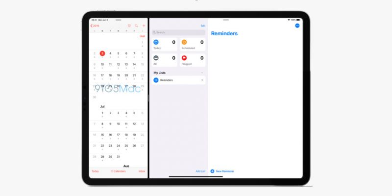
Another huge change that’s going to come to iOS 13 is that the Reminders app gets a major redesign. This feature will be updated for the Mac as well. Those using an iPad will benefit as there will be a large sidebar with split boxes for Today, Scheduled, Flagged and All. The app also features a search box and a collection of a user’s reminders. This isn’t all, the font will also be changed and it comes with SF UI Rounded font that was first introduced with the Wallet app on iOS 12.2.
The Find My Friends and Find My iPhone apps are going to marry and the new name for the combined app is Find My. This app has been significantly been improved on the iPad and it includes all features of both apps. The new app shows a big map that occupies the entire screen with a small window in the corner that displays the user’s family and friends as well as a separate tab for a user’s own devices. When the Dark Mode is enabled, the map here looks the same as Maps on Mac OS with its respective Dark Mode enabled.
Disclaimer: The above report is completely based on online rumours and leaks from the respective sources. These views and opinions do not necessarily represent those of Deccan Chronicle and/or other staff and contributors to this website.

